-

Roles
UX Design
Visual Design
Branding
-

Deliverables
User Surveys
Personas
Competitive Analysis
User Stories and Flows
Wireframes
Branding and Identity
User Testing
Visual Design
High Fidelity Prototype
-

Specs
Duration
3 weeks
Tools
Google Suite
Sketch
InVision
UsabilityHub
Adobe Illustrator
Problem
There are many existing separate cloud storage services that allow collection of content, content storage, content creation and collaboration, but no service that does all these things in one unified space. Having to navigate between all these services to find a single saved item is time consuming, frustrating, and confusing.
Solution
Brainspace aims to streamline and contain the ability to simply and easily collect content, create content, and collaborate in one centralized location instead of over many different applications. It allows users to save images, links, upload and access user files, create notes, and collaborate with others on those notes with a clean and simple interface.
User Surveys
I started my research with by surveying users to gain insight into how the current user base currently used cloud storage, what they liked about the services they used, and what were their pain points. Additionally, key behaviors in how users collected and used cloud saved content, basic demographics, and key use needs in cloud storage services was explored. See full user survey.
Features/Tools
Through this survey, presented to nineteen individuals, a few trends were uncovered. Over all groups, the following features were consistently marked as high importance for a cloud storage app.
There was a high indication that content collaboration/sharing, multiplatform access, and syncing were important features (100%). Additionally, users stated that they preferred folders as their method of content organization (90%).
The option to use a cloud storage application for free was overwhelmingly what users enjoyed the most about cloud storage. While 26% indicated that 50GB of data would be the minimum they would consider paying, 32% stated they were willing to pay $0.99/month for that storage.
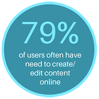
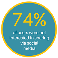
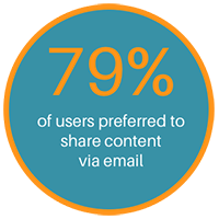
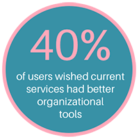
When asked about how they used online storage, 79% stated they often have the need for creating/editing content online, 74% indicated they were not interested in sharing their saved content via social media, 79% indicated they preferred to share via email—this was an interesting discovery because the client thought social media sharing was something their users would want—and 40% indicated they wished current services had better organizational tools.
Pain Points
Users indicated the following as causing most of their frustrations using cloud storage apps: poor security/privacy, poor content organization/searching features, content accessed across devices not synchronized, and confusing/difficult UI.
User Personas
Based upon the user survey results, three key personas were developed to highlight the most common user needs. The goal with the personas was to understand and empathize with the user’s needs and experiences in relation to how they would interact with the service.

Karla
Orgainized - Collaborative
- “Security and privacy of my cloud stored content is the utmost importance to me.”
About
- IT Professional
- Age 32
- Female
- Portland, OR
Bio
- Karla is an IT pro who enjoys learning about the latest technology trends. She frequently uses cloud storage both personally and for her job. She would love a cloud storage app that provided generous storage for an affordable price and was something she could use to share and collaborate with her coworkers.
Goals
- Ability to find specific stored content
- Quick and easy collaboration
- One location for all her cloud based content
Motivations
- Ample storage/upgrade options
- Simple collaboration
- Easy content sharing
- Strong security/privacy
Frustrations
- Lack of content organization and searching options
- Confusing and difficult UI

Chris
Content Creator - Sharing
- "I don’t have a lot of cash, so having a free cloud storage option is really appealing.”
About
- Graduate Student
- Age 25
- Male
- New York, NY
Bio
- Chris is a graduate student who enjoys spending his free time checking out the latest entertainment and meeting up with friends. As a full time student on a tight budget, he’s always on the lookout for any low cost tools to help him create content for classes and to share and collaborate with classmates on projects.
Goals
- Efficiently upload and create content
- Quick and easy sharing
- Editing and viewing content when on the go
Motivations
- Free storage subscription plan
- Ability to create documents for collaboration and sharing
- Easy to use interfaces
Frustrations
- Lack of content organization and searching options
- Lack of multiple platform support
- Data loss
Competitive Analysis
To determine where Brainspace would sit in the current market place, I started with an analysis--exploring SWOT, pricing, user feedback, and audience positioning--of the current competitive landscape to reveal opportunities Brainbox could capture. Using the client’s requirements, and the most popular services as indicated by the user survey as a guide, I looked at the top three players for those features. View full competitive analysis.

It was discovered that the competitors’ user base was slanted towards business teams and each tried to carve out their own unique niche in the market by focusing on a specific tight grouping of related features. The opportunity presented was for one centralized location with a simple, intuitive, and organized interface where everyday users could control all their content.
From the competitive ananlysis, the MVP priorities were determend. These included a clean/easy interface, strong content organizational features, multi-platform support, simple collaboration features, simple content creation features, attention to security and privacy
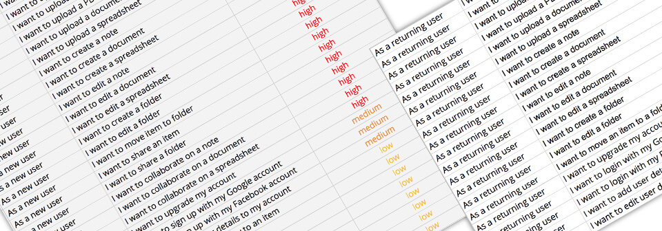
User Stories
With the business requirements and the motivations, goals, and pain points identified in the user personas, user stories were created for these tasks.
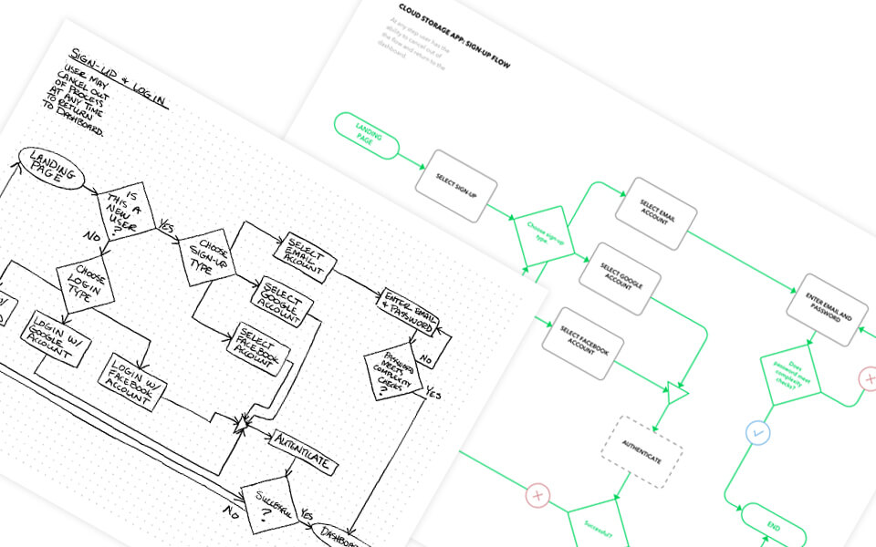
User Flows
The resulting user flows built out from the highest priority user tasks guided the essentials of what Brainspace’s MVP should contain. View the full set of sketches and final flows.
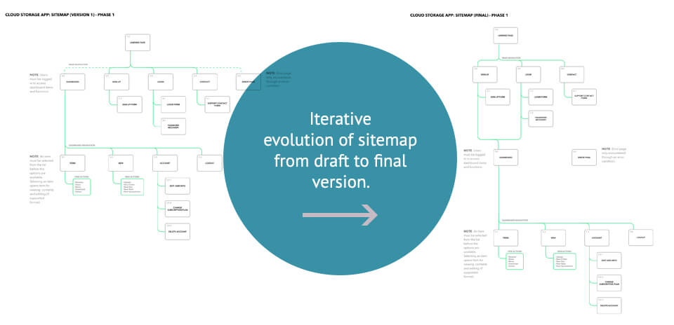
Sitemap
Following the userflows, a sitemap was designed to visualize how all these user flows would integrate with each together in a simple functional site. Several iterations were required to work out the most intuitive flow through the product’s site and to determine the best hierarchy for the product’s functionality. View the full size of draft and full size of final sitemap.
Wireframes
Before jumping into the low-fidelity wireframes, sketched versions were conceptualized to determine which layouts would best meet the needs of the users while remaining simple and easy to navigate.
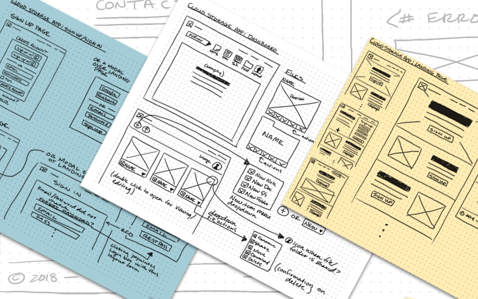
Using the sitemap, sketches, and client project requirements, low-fidelity wireframes were built for the Brainspace MVP. This build was then converted into a clickable prototype and tested on users to determine if navigation and UI was easy to use and functional, and if the product’s purpose was quickly and effectively conveyed to the users.
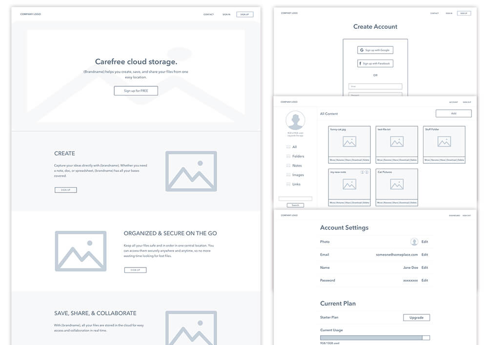
Through the testing process several issues with the navigation flow were discovered and adjusted accordingly in future revisions. The top action items included reworking side navigation filters, adding an indication on the account page that starter plan is free, fixing the credit card field, change some of the signup buttons on the landing page to provide more information, and adding a trash filter in dashboard. Below is a sample of one of the three user usability tests performed on the wireframe prototype.
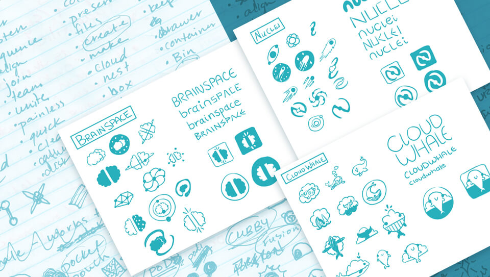
Branding
Looking at the current cloud storage service landscape, the branding for this product needed to differentiate itself while also eliciting the purpose of this new service. Many names were explored before eventually upon “Brainspace” to bring to mind a place to store all the content a user wants to remember. The feeling developed for this concept was spacious, simple, smart, thoughtful, fun, and open mind with the gap imagery in the logo mark. The brain inspired logo mark was also designed in a way to mimic cloud iconography, thus pulling in the idea of “the cloud” and all that entails. Additionally, the two halves of the brain invoke feelings of coming together and collaboration. The effectiveness of the brand’s goals were confirmed through user preference testing.
“I like that it suggests brain and cloud, which makes me think of smart and organized.”
~
“It looks...thinky, brainy; there are two halves, and the 'space' in the name implies a shared experience, reinforcing the two halves imagery.”
~
“Totally relate to brain space as I want good storage/organization so I have the brain space to be creative.”
Above are some of the feedback quotes from users during the logo preference testing. This preference testing on my top three logo choices determined the final look with 80% of users selecting the Brainspace name and logo.
With the logo finalized, the brand identity was built to complement and reinforce the feelings and functionality evoked through the logo. A style guide was developed with typography, colors, and UI elements to emphasize the core aspects of the Brainspace brand, namely fun, creative, intelligence, simplicity and collaboration.
Visual Design
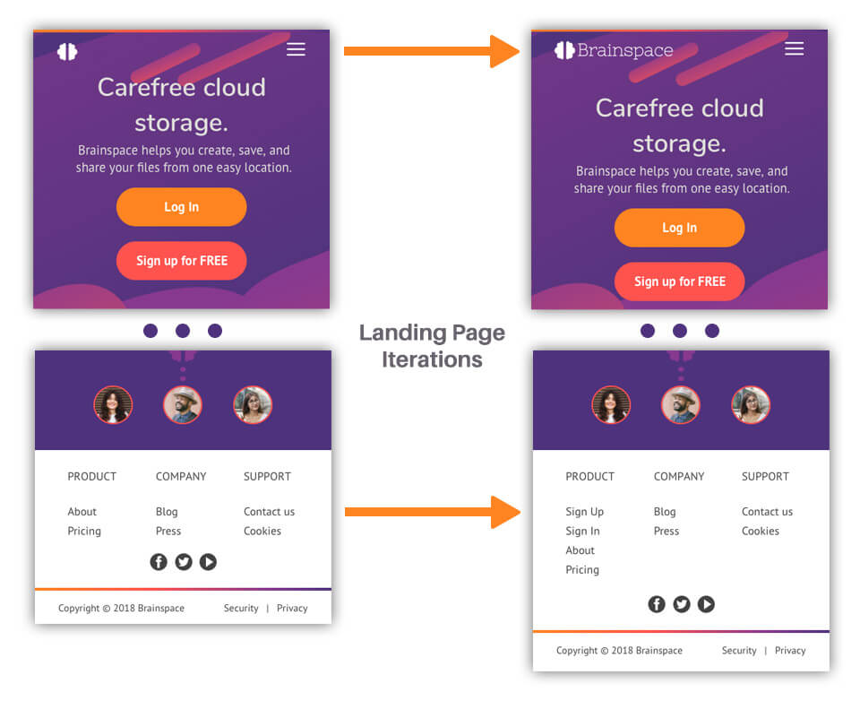
As the product was converted to a high-fidelity design, iterations were presented to users through preference testing to further refine the design for the most effective user experiences. Additionally, more user testing was performed as this stage to catch any issues and to gather more data on how users experienced the site.
Through this additional testing the design was further refined. Action items users identified as needing further attention were addressed through further design iterations.
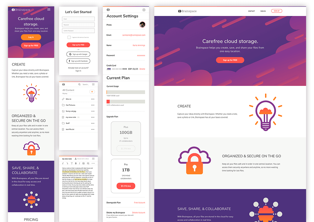
For the landing page, the Brainspace logo text was added next to the logo image as the full product brand was missing from the mobile version. At the bottom of the page sign in and sign up links were added to increase usability and encourage signing up for the service by elimitating the user task of hunting down those links at the top of the page.
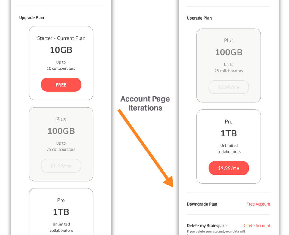
For the account page, the free plan downgrade option was moved further down the page and made smaller to encourage updrading and discourage downgrading while still making downgrading easy to find to maintain a positive user experience.
Once all the top action items were addressed, the final design was applied to the high fidelity clickable prototype. Since this is a mobile first design, the mobile version was the final version created and tested with the option of a desktop version at a future stage of this project.
What I Learned
The end result was a proof of concept that tied both the business requirements and user research derived usability requirements into a user friendly lightweight MVP. Through this process it became clear how cruital user testing is to the design process to make sure that the design works from a functionality and over all UX standpoint, to confirm the viability and feasibility of the client’s requirements within their target user base, and to also uncover opportunities that would be beneficial to the project. Iteration through user feedback loops were the most informative parts of this project.
A significant challenge of this project was the ambiguity of the client’s requirements and the lack of market research to support the business requirements of the product. Without such research, there was some division in the user wants and desires discovered in my survey research and the client’s feature requirements which may result in less than optimal adoption in such a highly saturated competitive environment.
With additional time and resources, I would build out additional test screens and conduct user testing to cover all of the product’s features including searching, filtering content, expanded collaboration, and note creating/editing. I would also build out and test the web version to discover any stumbling blocks to be solved with this responsive site.